
Renew Realty
One identity for a Bluffton real estate firm, carried from the postcard in the mailbox to the signature on an email.
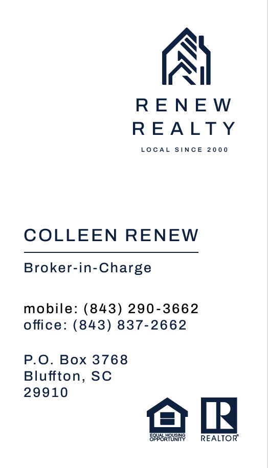

Colleen Renew needed her firm to look as established as her reputation. Every card, postcard, flyer, and page had to speak the same calm, polished language.
- Client
- Renew Realty
- Years
- 2024–present
- Location
- Bluffton, South Carolina
- Scope
- Brand identity, print, website
Modern lines, local roots.
Renew Realty has been local since 2000, and its identity looks ahead: a geometric house mark drawn in clean, even strokes, set beside wide, open capitals. It stays crisp at every size, from a phone screen to the front of a postcard.

#16243E#6E707D#C9C8C7#FFFFFFOne template, every listing.
Each new listing gets its own postcard: the house on the front with its address, its story, and the number to call. The photos and the words change from home to home. The brand stays.
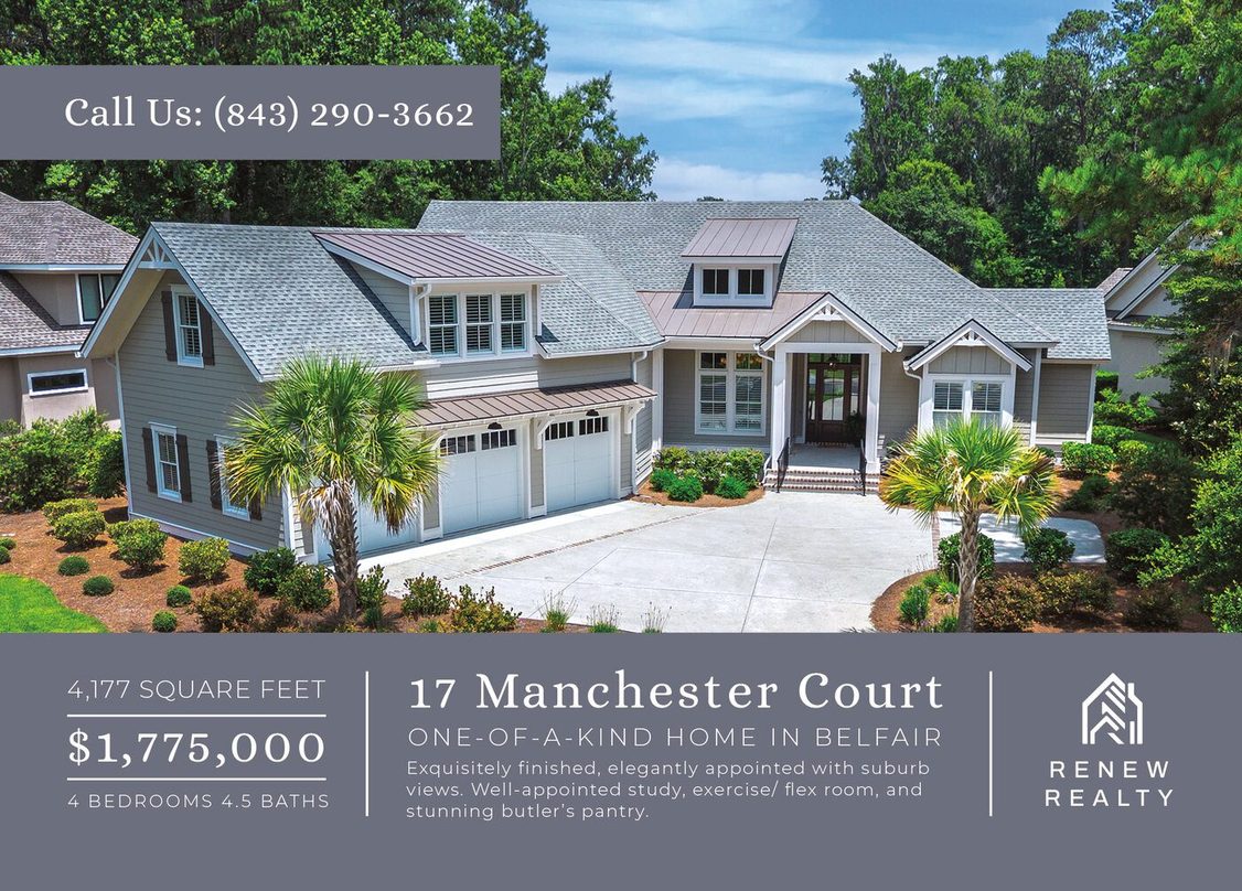
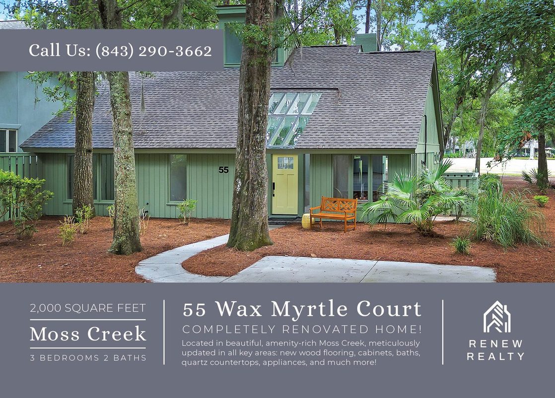
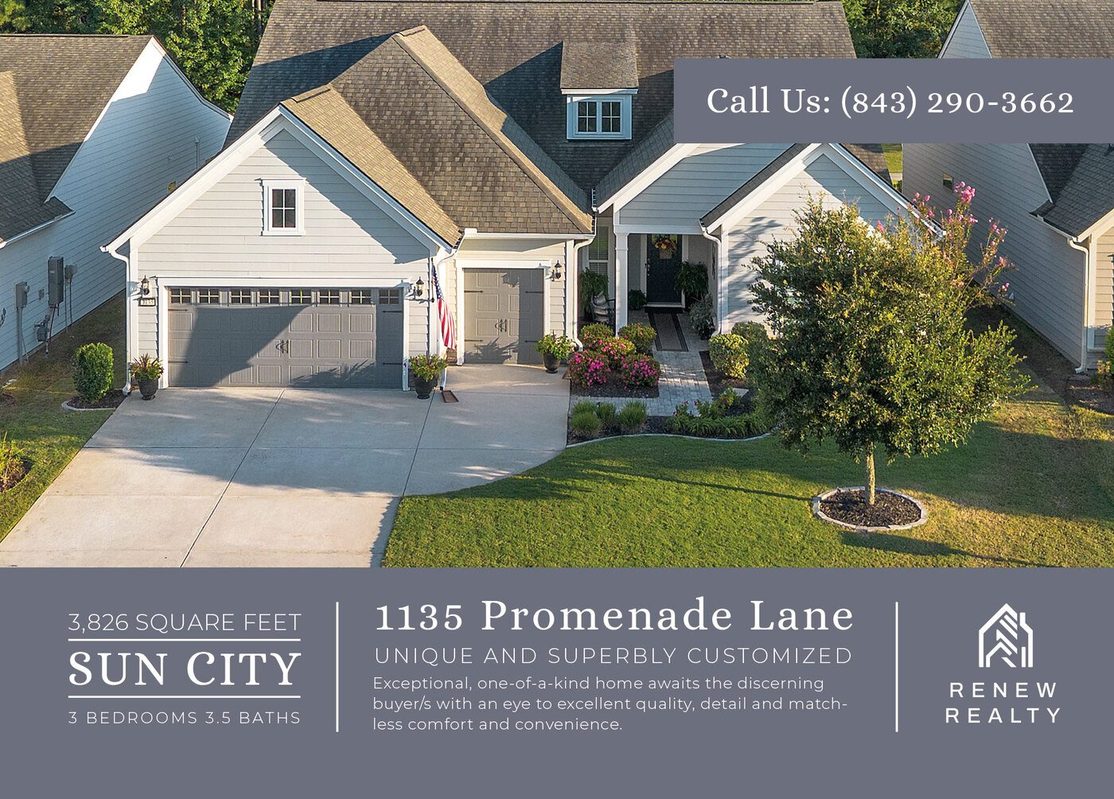
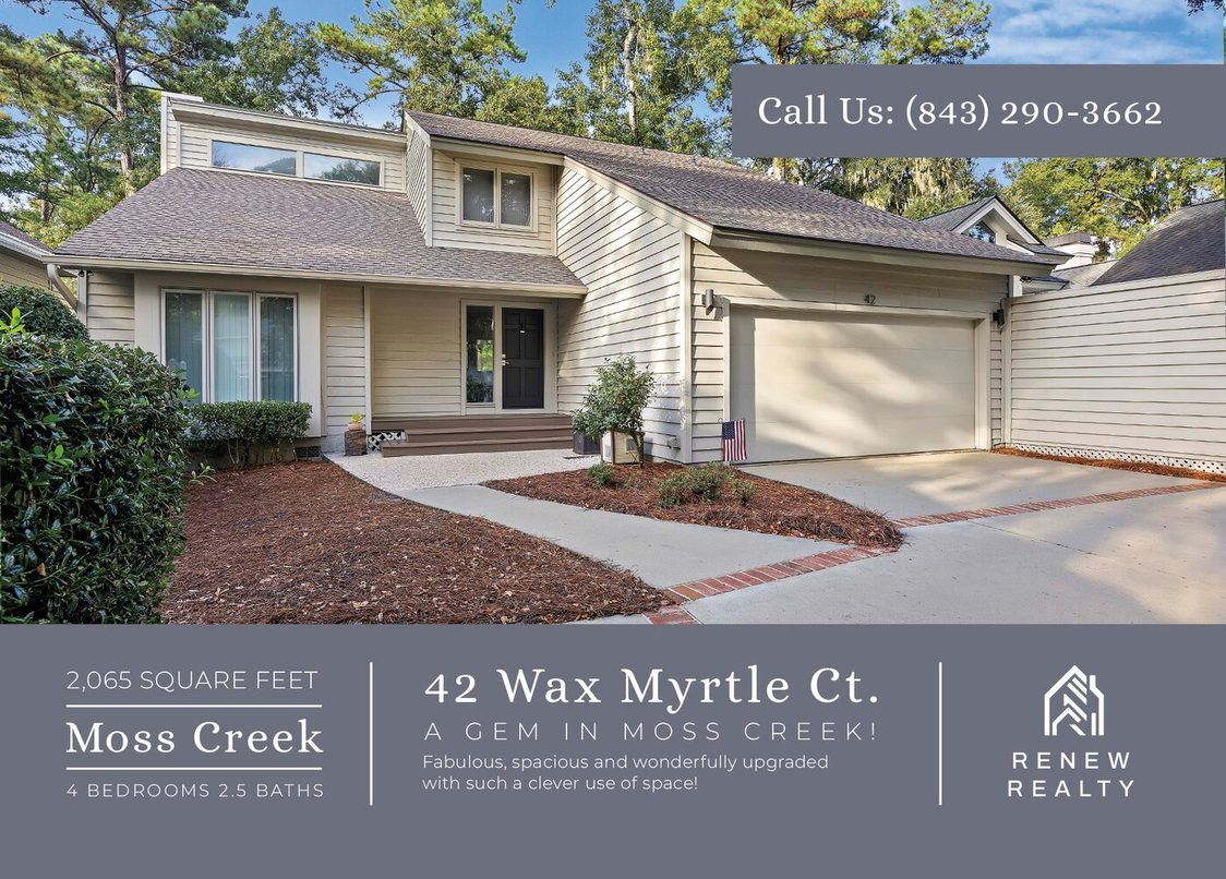
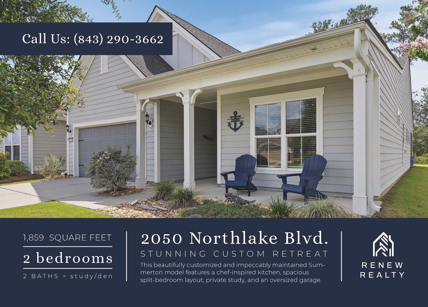
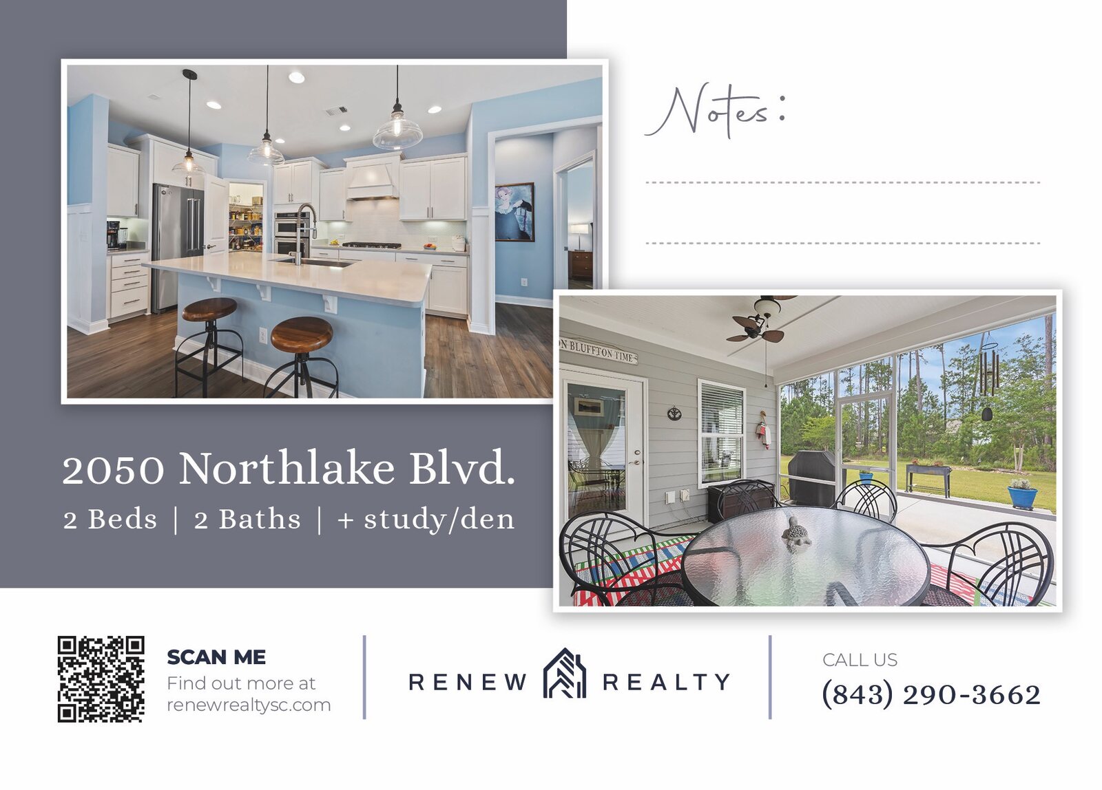
Ruled lines under “Notes” leave room for a few words by hand, and a QR code takes a neighbor straight to the listing page.
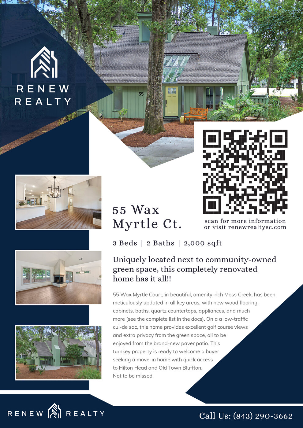
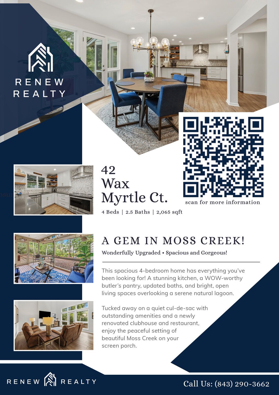
A full page for every home.
Angled navy corners, three rooms beside the story, and a QR code for buyers who want the rest. Two Moss Creek homes, one system.
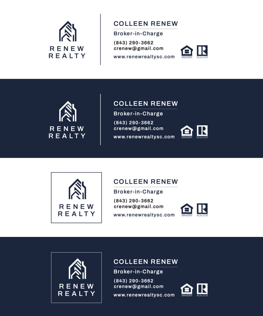
Cards for Colleen and her agents.
Business cards in white, navy, and black, and a matching set of email signatures in four styles, so even a quick reply looks like Renew Realty.

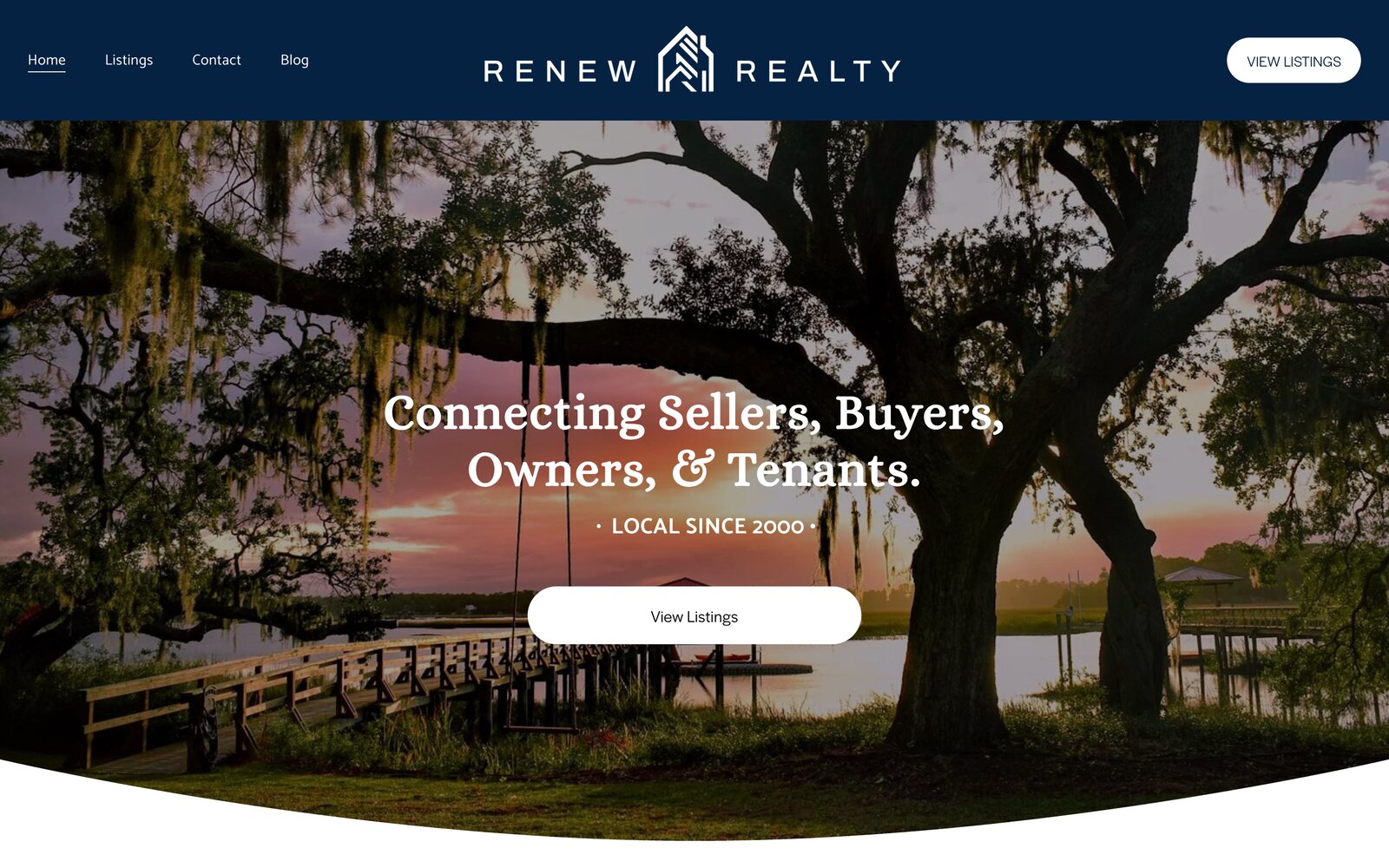
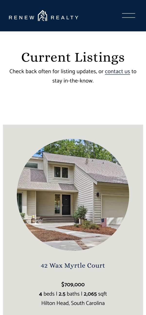
Every listing, one tap away.
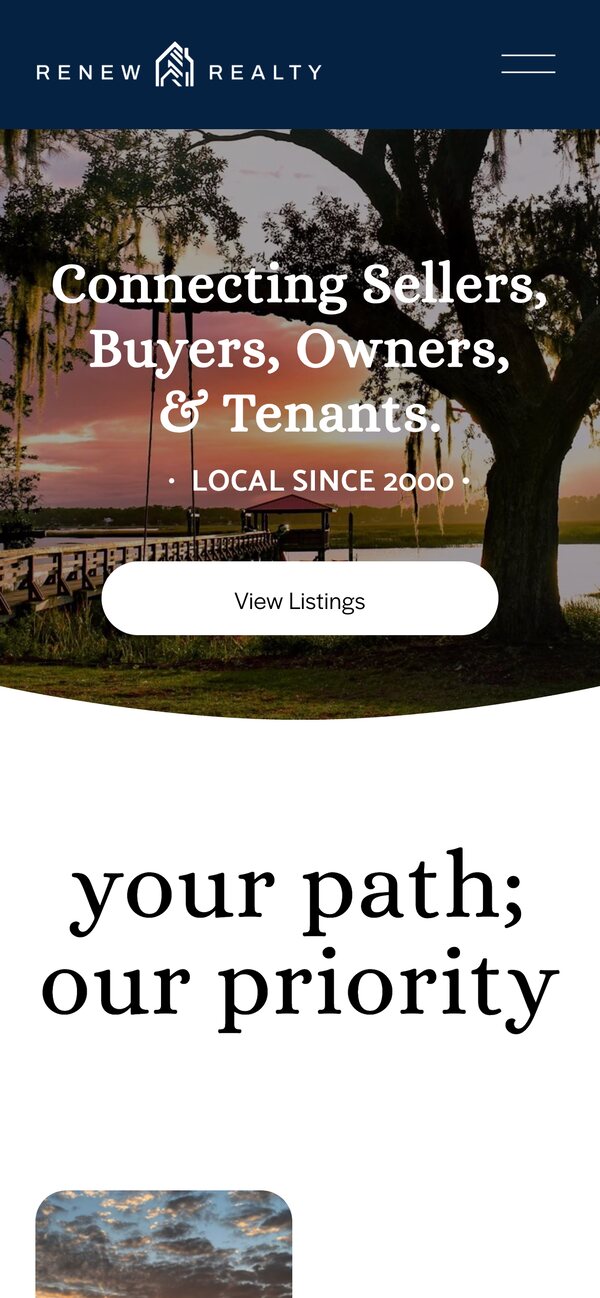
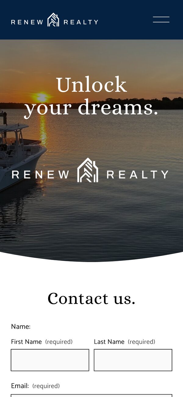
A website with current listings, neighborhood pages for Bluffton, Hilton Head Island, and Sun City, a blog, and an easy way to reach Colleen.
Identity
- House mark & wordmark
- Stacked & horizontal lockups
- Color & type
- Business cards
- Listing postcards
- Listing flyers
Digital
- Website
- Neighborhood pages
- Email signatures
Branded goods
- Presentation folders
- Pens & sticky notes
- QR codes