Studio Ferro
A script wordmark, a woven ironwork pattern, and printed pieces for a designer home furnishings shop on West Bay Street in Savannah, Georgia.
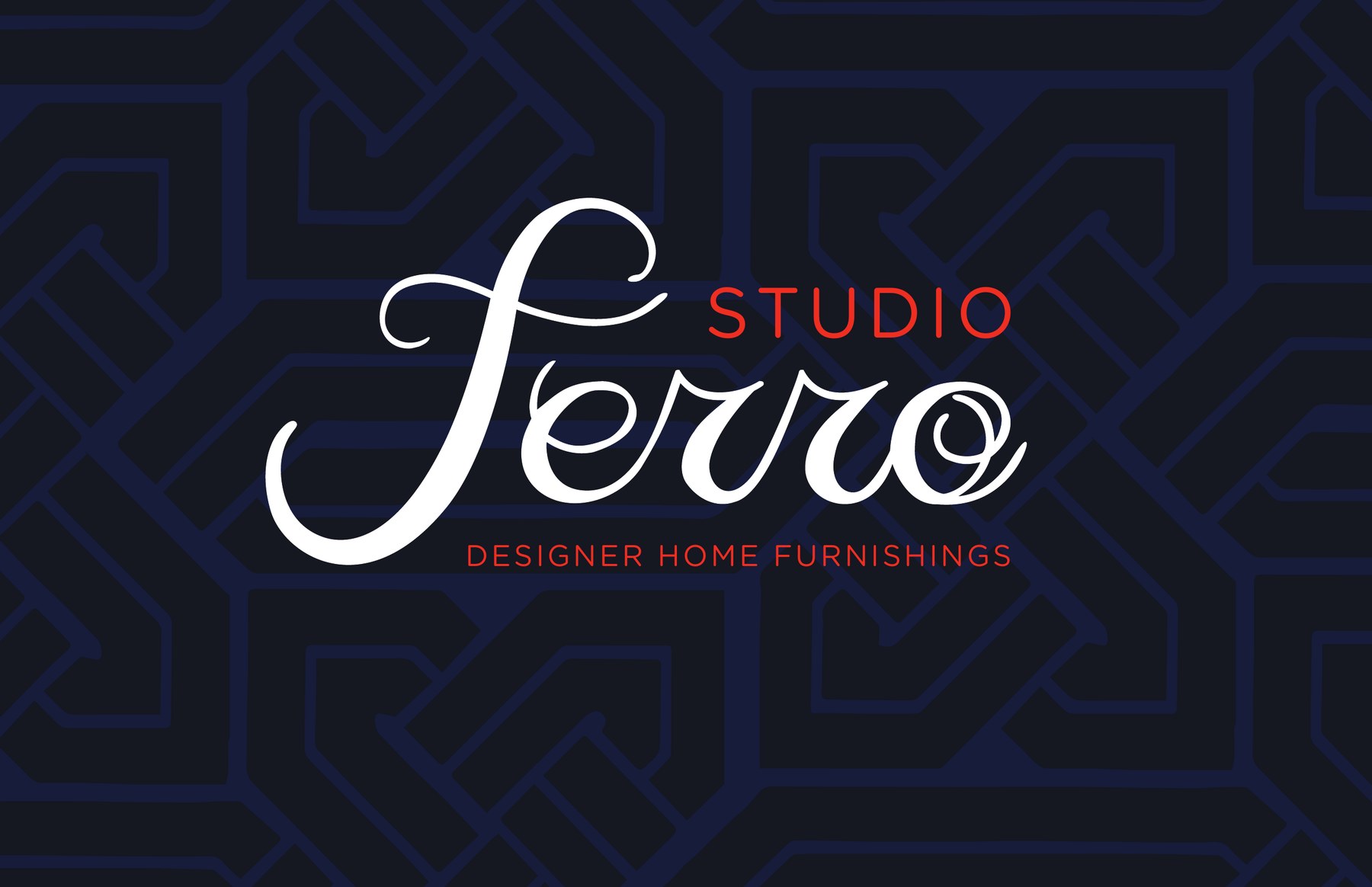
Ferro means iron. The mark had to feel as personal as a signature and as lasting as the wrought iron along Savannah’s old streets.
- Client
- Studio Ferro
- Location
- Savannah, Georgia
- Year
- 2015
- Scope
- Logo, pattern, business cards, tags, style guide, sign artwork
A signature in wrought iron.
The wordmark is drawn as one long, flowing script. The F sweeps wide to anchor the name, and the double R was redrawn until it could never be read as a U. Small capitals carry STUDIO above and DESIGNER HOME FURNISHINGS below, in a warm signal orange.
Iron, woven.
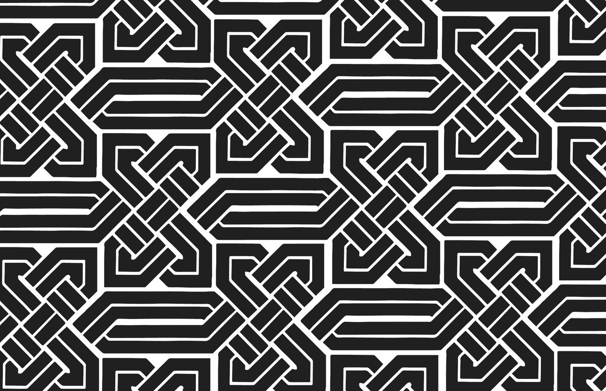
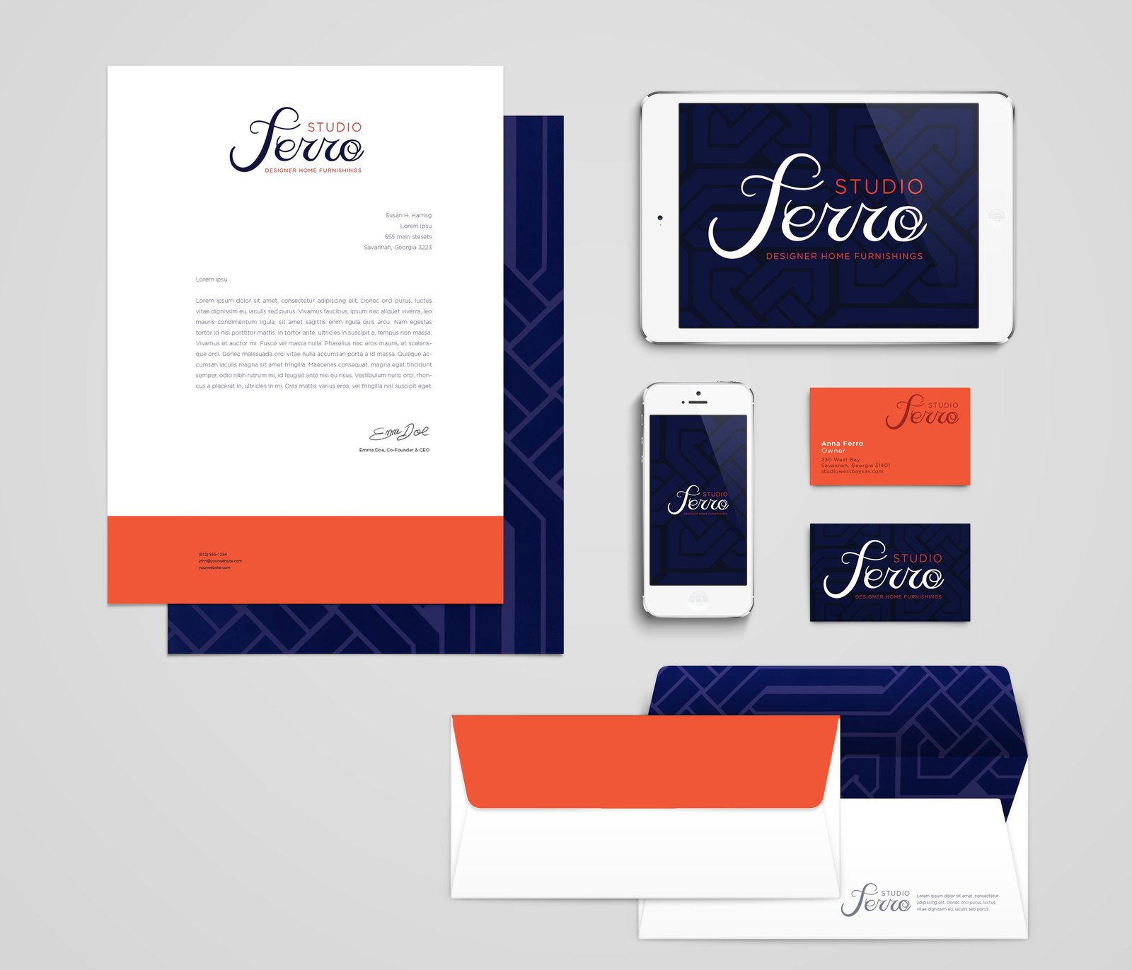
An interlaced pattern of bars and knots, like the ironwork on a garden gate, runs behind the mark in navy on navy. It gives every dark surface a quiet texture and ties each piece back to the name.
One voice, every piece.
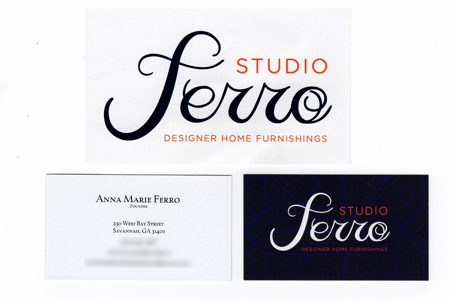
Letterhead, envelopes, cards, and screens all share the same navy, orange, and woven texture. A short style guide set the fonts, the colors, and the pattern, so the sign maker and every printer could match the work.
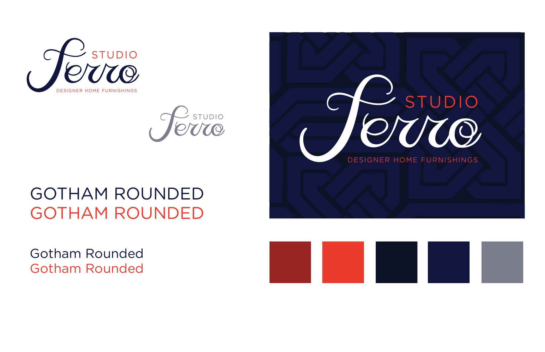
The colors were set to Pantone 1655 orange and 281 navy for the dimensional-letter sign on the storefront.
Before it was Ferro.
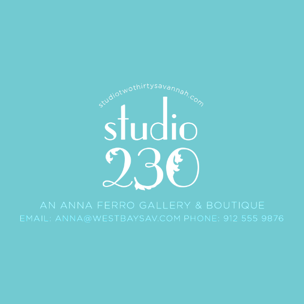
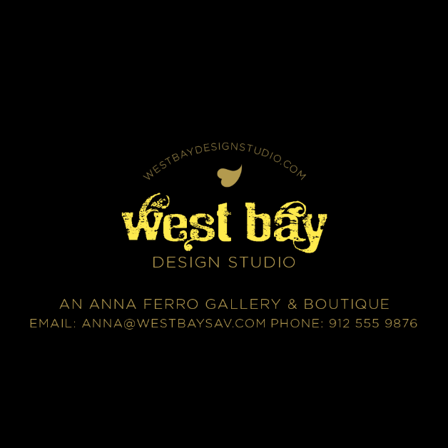
The first concepts tried other names and other moods, from a bold numeral to a soft, sunlit seal. Each round brought the shop closer to the one it became.
Identity
- Script wordmark
- Woven pattern
- Color palette
- Business cards
- Tags
- Stationery
Guidance
- Style guide
- Storefront sign artwork